Design Terms 101
Introduction
Our goal is to support the baseline understanding of the design-isms and other related terms that are being used in the department in order to support the adoption design. Language support can be an entry into more meaningful dialogue with a particular topic. Before we start understanding how to best support, we want to capture and define the words that may have caused confusion.
Jump to:
A, B, C, D, E, F, G, G, H, I, J, K, L, M, N, O, P, Q, R, S, T, U, V, W, X, Y, Z
A
Accessibility
| Definition | Accessibility [for design’s purposes] refers to the design of products, devices, services, or environments so as to be usable by people with disabilities. |
|---|---|
| Source | Henry, Shawn Lawton; Abou-Zahra, Shadi; Brewer, Judy (2014). The Role of Accessibility in a Universal Web. Proceeding W4A '14 Proceedings of the 11th Web for All Conference Article No. 17. ISBN 978-1-4503-2651-3. Retrieved 2014-12-17 |
| In our own words | Accessibility makes things easier and better for everyone, not just those with different needs. It ensures that everyone can be served by the government fairly and equally, just like our bilingual requirements. Accessibility is required by law (Accessible Canada Act), and needs to be applied to all areas of policy, program, communications, services and products. |
| Demonstration | Project with Canadian Digital Service and the Canadian Revenue Agency (CRA): To support low-income Canadians file their taxes, the CRA created in-person, free tax clinics. After some time, they investigated the outcomes of the service. They found that the numbers of returns from this group had continued to decrease. The CDS team began to investigate how to create an accessible service that met the needs of this group. They investigated both offline and online options. Service Design In Government, Clementine Hahn, CDS (2:21 - 18:39) |
“Agile”, agile methodology
| Definition | A colloquialism for: 1. agile software development, The Agile Manifesto, agile principles, or values. |
|---|---|
| Source | |
| In our own words | Agile is a way of working. It means working in a lightweight, iterative, responsive way. These practices lead to a greater chance of meeting client's and user's expectations in a shorter time frame. Agile comes from the Agile Manifesto, a set of four values and twelve principles. So, saying “agile” on its own can be unspecific when used to summarize all the many aspects of agile. Often, non-software teams practicing “agile” go through a process of adapting the principles and values to their context. It’s important to understand what aspects of “agile” a team or organization is committing too. Agile vs Scrum Agile and scrum are different things. Scrum is a software development framework based on agile values and principles. |
| Demonstration |
|
Alpha phase
| Definition | [In the context of service design] The second phase of the agile service design lifecycle. Alpha is a chance for you to try out different solutions to the problems you learnt about during your discovery. |
|---|---|
| Source | Gov.UK Service Manual |
| In our own words | Exploring different solutions through prototyping and testing. |
| Demonstration |
Transport Canada’s Remotely Piloted Aircraft Systems Task Force partnered with Code for Canada to build a tool to support recreational drone pilots fly more safely and in accordance with the new regulations. In the alpha phase of the project, the Digital Drone Collective iterated through three product directions:
|
B
Beta phase
| Definition | [In the context of service design] The third phase of the agile service design lifecycle. The beta phase is where you take your best idea from alpha and start building it for real. It also involves thinking about how your service will integrate with (or start to replace) existing services, and preparing for the transition to live. |
|---|---|
| Source | Gov.UK Service Manual |
| In our own words | Taking your best prototype and building it for real. There’s often a “beta release” to a group of people, or the public, to test the product. The product transitions out of the beta phase once the initial product offering is stable and working as intended (inclusive of business outcomes). |
| Demonstration | CDS partnered with Code for Canada and Veterans Affairs Canada to build a tool that would help veterans access services more easily. The product is still in beta testing, and can be viewed here: https://vac-handoff.herokuapp.com/ [en] https://vac-handoff.herokuapp.com/?lng=fr [FR] |
C
Change Management
| Definition | 1. The process, tools and techniques to manage the people side of change to achieve a required business outcome. |
|---|---|
| Source | 1. Prosci |
| In our own words | TChange management is designing the “people-side” of change, as in, the internal, operational and organizational functions. Understanding the necessary factors for change informs the transition planning from the current state to the future planned state. |
| Demonstration |
Paper-based processes center around the handling and processing of information on a form. It is often submitted through a one-way transaction (e.g. a mailed letter). In contrast, digital service delivery is about managing client relationships. Examples of this are:
This is a major change in the way we currently operate at TC. To support this change, the Change Management CoE tries to raise awareness on the implications of doing business online. We try to inform our clients about existing solutions like: |
Co-design (participatory design, cooperative design)
| Definition | 1. Co-design is an approach to design attempting to actively involve all stakeholders (e.g. employees, partners, customers, citizens, end users) in the design process to help ensure the result meets their needs and is usable. |
|---|---|
| Source | 1. Mitchell, Val; Ross, Tracy; Sims, Ruth; Parker, Christopher J. (2015). "Empirical investigation of the impact of using co-design methods when generating proposals for sustainable travel solutions". CoDesign. 12 (4): 205–220. doi:10.1080/15710882.2015.1091894. |
| In our own words | Co-design goes beyond consultation or user research… it brings stakeholders into the defining, researching, planning, and testing processes. A key tenet of co-design is that users, as 'experts' of their own experience, become central to the design process. |
| Demonstration | Here’s a case study of how the Policy Lab at the University of Melbourne used co-design to inform their driver’s licensing program: Co-Design for Government: Magic Bullet or Magical Thinking? Emma Blomkamp, The Policy Lab, The University of Melbourne, Australia |
D
Design (See related: Human-centred design, User Experience Design, Co-design)
Design (See related: Human-centred design, User Experience Design, Co-design)
| Definition | A design is a plan or specification for the construction of an object (or system or for the implementation of an activity or process), or the result of that plan or specification in the form of a prototype, product or process. |
|---|---|
| Source | Dictionary meanings in the Cambridge Dictionary of American English, at Dictionary.com (esp. meanings 1–5 and 7–8) |
| In our own words | Design as a noun: Explains how a thing should work and what it should look like. Specifies to the level necessary to begin making the thing. Design as a verb: The process of figuring out what a thing should be, why it should be, and how it should be. Design as a profession: The word “design” paired with a medium or industry implies the design of that thing. For example, product design is the design of products. Service design is the design of services. Graphic design is the design of graphics used in visual communication. Design vs Human-centred design: Not all design takes a human-centred approach. Jump to human-centred design. |
| Demonstration | An example of designs for a product for an initial beta release: Drone Companion App wireframes A website with examples of a design specifications in different areas of products: https://sites.google.com/site/stevensonstechnologyclassroom/design-cycle/criterion-b-design/design-brief-design-specification Early sketches or refined sketches like this can be called “designs”. 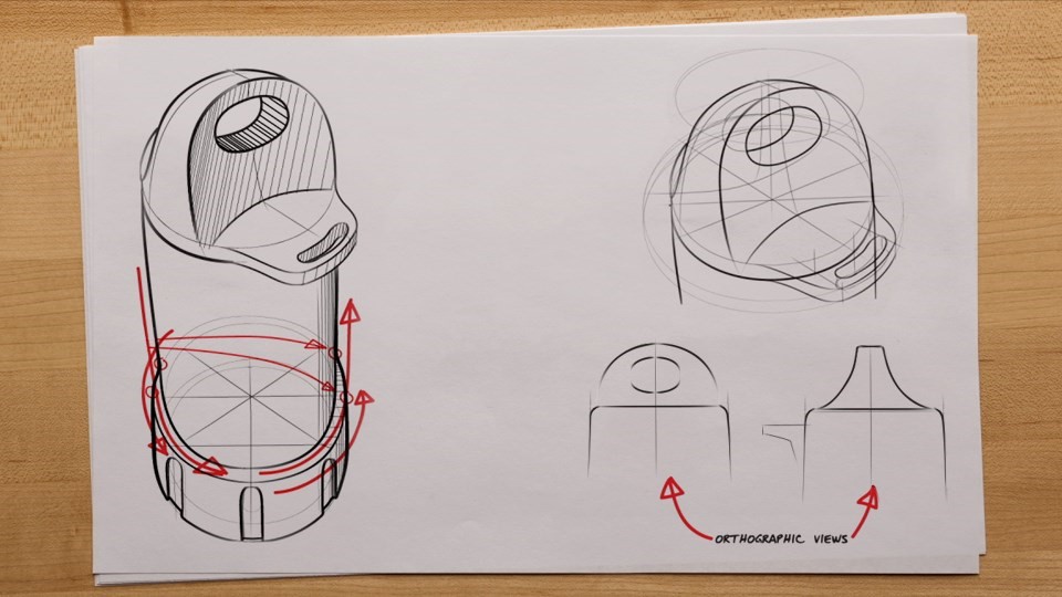 [Image caption: a weird-shaped lid drawn in pencil in several views, with red arrows indicating functionality.] |
Design jam
| Definition |
|
|---|---|
| Source | |
| In our own words | Think of as a hack-a-thon, but for the human-centred design process. That said, we see design jam used as a catch-all term for design workshops. A design jam on its own is not enough to fulfill problem discovery or product ideation. Design jams support an aspect of a design process. Workshops can support seeking information or ideas from a group of stakeholders. The findings generated still need further effort to analyze and interpret. |
| Demonstration | Here’s a design jam outline from the Centre of Excellence conducted for Transport Canada’s Legal Registry team. A case study of how a design jam was used in the City of Toronto’s Employment Works program. Code for Canada Summit 2020 Video, between 18:50 - 36:50 |
Design research (See related: User research, Public Opinion Research)
| Definition |
|
|---|---|
| Source |
|
| In our own words | Design research is a catch-all term for the different research approaches used in the design process. Human-centred design uses many types of research. In product design, the focus is on user research--but research on the domain and organization is also necessary. Different fields of research are also relevant to the term. For example, ethnographic research, behavioural insights and public opinion research. Instead of specifying the different types of research, designers can use “design research” to simplify. As well, using this term supports multidisciplinary processes and practices. |
| Demonstration |
|
Design sprint
| Definition | The [design] sprint is a five-day process for answering critical business questions through design, prototyping, and testing ideas with customers. |
|---|---|
| Source | Google Ventures (the creator of the methodology) |
| In our own words | A design sprint is a rapid, miniature version of a design process. By restricting the process, it can unblock teams and find opportunities. It focuses on rapid prototyping as a means to quickly assess solution viability. It’s not meant to replace the design function in a team, or be the only means of ideation. |
| Demonstration | In the Code for Canada Fellowship program, the newly-formed teams complete a design sprint. This practice helps the teams to get acquainted with each other and their problem space. The Digital Drone Collective’s sprint challenge was to investigate the Where to Fly tool. This application, developed by the National Research Council, shows where airspace is. Here is their presentation of the 5-day sprint. (This version of the tool has since been replaced.) |
Design thinking
| Definition | 1. Design thinking is a process for creative problem solving. Design thinking has a human-centered core. It encourages organizations to focus on the people they're creating for, which leads to better products, services, and internal processes. When you sit down to create a solution for a business need, the first question should always be what's the human need behind it? |
|---|---|
| Source | 1. IDEO U |
| In our own words | Design thinking came from simplifying and packaging agile and human-centred design processes. This supports the application of foundational design practices outside of traditional design industries. Read further: Wikipedia |
| Demonstration | 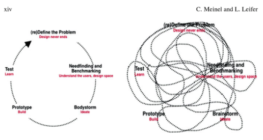 [Image Caption: A graphic of two models of the design-thinking process, one showing a visually cohesive model, the other, showing how the phases are more realistically navigated. On the left, the simplistic circular view of a design-thinking process shows a dotted arrow travelling through the phases: redefine the problem, needfinding and benchmarking, ideate, prototype, test. On the right, the dotted arrow travels to each of the phases in a non-linear order, creating a squiggly mess.] |
Discovery phase
| Definition | [In the context of service design] The first phase of the agile service design lifecycle. Before you commit to building a service, you need to understand the problem that needs to be solved. |
|---|---|
| Source | Gov.UK Service Manual |
| In our own words |
This stage is to understand the problem that needs solving. We can do this by learning about:
To answer these questions, we use different methods of research. Empirical evidence is key to getting reliable insights. |
| Demonstration | In the Digital Drone Collective spent three months in the discovery phase. Most projects like this suggest two months for discovery, but it can depend on the scope of the problem and the methods needed. The team needed to understand the full scope of the impact of the new regulations on recreational drone pilots. In this instance, the new policy had many new requirements and services, which meant the potential problem space was also large. The team also needed to be creative in user research. There weren't any users to learn from because the project had started before the new regulations were released. Instead, they used an ethnographic research method called immersion to become drone pilots and study themselves. This type of study was in-depth, and also added time to the discovery phase. A study of this depth might not be typical for a pre-existing business, or a well-scoped problem area. But here, the discovery phase could not be complete until there was an initial capture of someone’s journey under the new regulations.Meeting Canada’s Newest Aviators - Andee Pittman |
E
Empathy
| Definition | Empathy is the capacity to understand or feel what another person is experiencing from within their frame of reference, that is, the capacity to place oneself in another's position. |
|---|---|
| Source | Bellet, Paul S.; Michael J. Maloney (1991). "The importance of empathy as an interviewing skill in medicine". JAMA. 226 (13): 1831–1832. doi:10.1001/jama.1991.03470130111039. |
| In our own words | Human-centred design aims to create empathy between the various stakeholders. Having stakeholders feel the frustration of unmet needs can cause teams to get the support they need to address the problem. There are many ways to cultivate empathy in the design process. For example, personas, or watching videos of users performing problematic tasks in a usability study. Don't emotions get in the way of decision-making? The ultimate goal is not for designers to evoke emotional responses to base decisions on alone. The goal is to bring the user’s experience into the decision-making equation, as it’s often not included. Good strategy balances user's needs, business needs, and technical feasibility. This often leads to compromises. Having an understanding of how users think, feel, and use your solution can guide responsible, low-risk compromises. How much you compromise on user needs influences business results. So the processes of measuring and learning from the approach is paramount for finding the right balance. |
| Demonstration | Personas are often used in the design process to summarize the main behaviours and pain points of a target user group. The use of images and human characteristics attempt to evoke empathy for the user. |
F
G
H
Heuristic evaluation
| Definition | Heuristic evaluation is a usability engineering method for finding usability problems in a user interface design, thereby making them addressable and solvable as part of an iterative design process. |
|---|---|
| Source | Interaction Design Foundation |
| In our own words | Experienced designers using industry-standard criteria to check the usability of a product. It can be a replacement for user research when research is not feasible. Or as a place to start to get “low-hanging fruit” before testing with users. |
| Demonstration | [insert NPP example] Nielsen Norman Group has identified 10 Heuristics for product design that have been adopted widely when heuristics are needed. They can be read here: 10 Heuristics for User Interface Design - Nielsen Norman Group |
Human-centred design
| Definition | 1. Human-centred design is an approach to interactive systems development that aims to make systems usable and useful by focusing on the users, their needs and requirements, and by applying human factors/ergonomics, and usability knowledge and techniques. This approach enhances effectiveness and efficiency, improves human well-being, user satisfaction, accessibility and sustainability; and counteracts possible adverse effects of use on human health, safety and performance. |
|---|---|
| Source | 1. ISO 9241-210:2019(E) |
| In our own words | Human-centred design (HCD) is creating solutions around people's needs. These needs are defined by empirical evidence into behaviours and emotions. It all comes down to the fact that humans act in irrational, illogical ways. What people think they do, say they do, and what they actually do are often different. So to effectively solve problems for humans, we need to understand their behaviours and experiences. This is why much of user research is “boots on the ground”, observing and experiencing with people. This contrasts current approaches in business research. Many tactics only collect what people think. Examples of this are Public Opinion Research, focus groups, and interviews. |
| Demonstration | The Digital Drone Collective took a human-centred design approach. Their mission was to support recreational drone pilots in following the new regulations. They did this by conducting user research at every stage throughout their project. One of the most insightful pieces of research was having drone pilots conduct a site survey and write about it. They would document both the site survey and their experience doing it. Then we gave their site surveys to a Transport Canada inspector. They evaluated their responses as if the inspection were happening in real life. This gave us insight into what Transport Canada looked for in compliance. To go through the different research findings and influences to product strategy, you can read the Transition Manual, “Product Strategy”. |
I
Information Architecture (IA)
| Definition |
Information architecture has somewhat different meanings in different branches of Information systems (IM) or Information technology (IT):
|
|---|---|
| Source |
|
| In our own words | For product/web design: The ultimate goal is to help users find information and complete tasks. |
| Demonstration | A common example would be a sitemap. On the footer/bottom of many websites there will be a link to a sitemap. A sitemap is an artifact showing the information architecture of a website. These are included for accessibility and for search engine optimization (SEO) purposes. An example of information architecture for an app from the Drone Companion App: 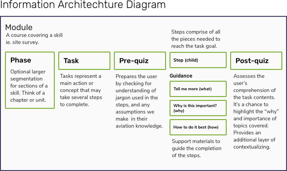 [Image caption: Information architecture diagram [Image caption: Information architecture diagram Module: A course covering a skill, i.e. site survey Phase: Optional segmentation for sections of a skill. Think of a chapter or unit. Task: Tasks represent a main action or concept that may take several steps to complete Pre-quiz: Prepares the user by checking for understanding of jargon used in the steps, and any assumptions we make in their aviation knowledge. Step (child): Steps comprise of all the pieces needed to reach the task goal. Guidance: Support materials to guide the creation of the steps. Tell me more (what). Why is this important? (why). How to do it best? (how) Post quiz: Assesses the user’s comprehension of the task contents. It’s a chance to highlight the “why” and the importance of topics covered. Provides another layer of contextualizing.] |
J
Journey map (aka customer journey map)
| Definition | A visual representation that describes step-by-step how a person interacts with a service. Key components of a journey map include the journey broken down into separate phases, user’s motivations/goals and expectations, touchpoints, the user’s emotional state, and obstacles encountered. |
|---|---|
| Source | Nielsen Norman Group |
| In our own words | These maps show the user's experience in achieving their goal(s) with the product/service. They capture the thoughts, behaviours, and feelings during the interactions. The journey-aspect shows the ideal workflow, as well as alternatives. Together they enable teams to understand areas of improvement in context. |
| Demonstration | For the Digital Drone Collective, the primary output of the Immersion Study was a journey map. The team was able to identify an ideal journey of how a recreational drone pilot would go from buying a drone to flying safely and legally. This allowed the team to combine challenges found in the current state and ones they had experienced in the new state. All the data was mapped by the entire team on a massive paper journey map. Here’s the elements of the map tied together in a slide deck. Those journeys were then synthesized and digitized in a Trello board. (The board is public and can be viewed here.) From this, they could understand the underlying problems and create a problem statement. |
Jobs to be done (JTBD)
| Definition | Jobs-to-be-done (JTBD) is a framework based on the idea that whenever users “hire” (i.e., use) a product, they do it for a specific “job” (i.e., to achieve a particular outcome). The set of “jobs” for the product amounts to a comprehensive list of user needs.1 |
|---|---|
| Source | 1. Personas vs. Jobs-to-Be-Done |
| In our own words | It’s a way to frame solution functionality from the perspective of the end-user. Understanding the “jobs” your solution needs to do helps ensure that the user's needs are met. It's detached from a solution and moves toward the person's true motivation. This leads to better innovations. Kathy Sierra best captures the essence of this strategy, “Upgrade your user, not your product. Don’t build better cameras — build better photographers.” It connects product strategy to business strategy. JTBD is a way to probe intentions and value propositions. This helps make business decisions related to product offerings and finding competitive advantages. |
| Demonstration |
Examples:
Further reading: |
K
L
Live phase
| Definition | [In the context of service design] The fourth phase of the agile service design lifecycle. The live phase is about supporting the service in a sustainable way, and continuing to iterate and make improvements. |
|---|---|
| Source | Gov.UK Service Manual |
| In our own words |
The goal of this phase is to support the service in a sustainable way, continuing to iterate and make improvements. This involves:
|
| Demonstration | The Drone Management Portal entered the live phase on January 9th, 2019 when it was released alongside the announcement from Transport Canada’s Minister, Marc Garneau. It continues to be developed and improved. |
M
Minimum Viable Product (MVP)
| Definition | 1. The minimum viable product is that version of a new product which allows a team to collect the maximum amount of validated learning about customers with the least effort. |
|---|---|
| Source | 1. Eric Ries, author of the Lean Startup |
| In our own words | Using an “MVP” approach means finding out how to test your idea by investing the smallest amount in the idea or prototype. By taking this approach, you can de-risk new ideas and solutions by learning if you can make it work. This often means specifying new behaviours and finding ways to test if the solution can change the behaviour. Through this process, you can support the most difficult changes for users to ensure your product's success. |
| Demonstration |
This example comes from a great case study by Jarod Spool about an insurance company. They wanted to save the company money by having customers take their photos for insurance claims instead of a professional. Instead of building an entire platform to learn if it could be done, they broke the idea into questions. The first question was, could they get customer-supplied pictures that would be good enough for the claims adjusters? To answer this question, they recruited a handful of claims agents to help with an experiment. When those agents would get a call from a customer opening a new damage claim, they’d ask that customer to send in some photos. They were able to learn that they would need to provide support to the customer to take better pictures. They kept iterating on their instructions until the photos were of adequate quality, proving it was a viable solution. Avoiding the Wrong MVP Approach - Jarod Spool |
N
O
P
Persona
| Definition | In user experience research, a persona is used to personify a specific user group based on certain qualities, such as demographics, technological literacy, frequency of interaction with a service provider, etc. There are many different kinds of personas depending on the service and the user groups you are researching. |
|---|---|
| Source | Nielsen Norman Group |
| In our own words | A persona is a design tool that summarizes findings from user research. It's a one-page, fictional profile based on the evidence collected. The profile format provides a quick reference to all the aspects a designer considers in the design. Because of this, it can support alignment with project teams and stakeholders. Personas often include a user's motivations, frustrations, and scenarios of use. To note, you may see personas at the centre of debates. Many have identified that there are several ways in which personas can fail to serve their purpose. Further, a poorly executed persona can have negative unintended consequences. For example, too much focus on demographics can perpetuate stereotypes and other biases. These risks can be seen greater than the benefit of the tool. Please refer to Understand your users with personas for more information. |
| Demonstration | Here’s a persona created as a prototype for the Departmental Persona Project from the Service Innovation Centre of Excellence. To see full size, you can download the image here.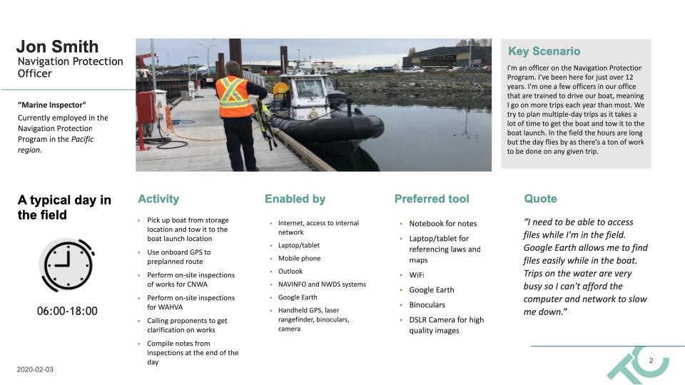 |
Problem statement
| Definition | 1. A problem statement is a concise description of an issue to be addressed or a condition to be improved upon. It identifies the gap between the current (problem) state and desired (goal) state of a process or product. |
|---|---|
| Source | 1. Kush, Max (June 2015). "The Statement Problem". Quality Progress. 48 |
| In our own words | A problem statement sets the direction of the entire design process. It summarizes who the user is, what the problem is, and what the needs are--all without going into what the solution should be. Further reading - Wikipedia: Problem Statement |
| Demonstration | The Digital Drone Collective decided to introduce the problem statement in a larger, summative discovery research artifact, titled “Opportunity Statement”. The problem statement: “How might we empower basic drone operators to conduct their first site survey in order to fly their drone safely? Recreational drone operators are likely to face many challenges under the new regulations, from becoming certified to enacting safety procedures to standard. They need support and guidance from Transport Canada as the regulator of this environment. These people aren’t traditional aviation clients that the department is used to interfacing with, for example, AirCanada, whose business depends entirely on compliance. If Transport Canada wants voluntary compliance, the process will need to seem manageable for these everyday people. This means addressing how Transport Canada supports users in following the regulations. The Digital Drone Collective will need to start small to learn about how we might tackle regulation guidance with a digital tool in order to bring it to scale. To do this, we are going to investigate how we can best facilitate the learning of the most challenging part of the regulations, the site survey. Through this, we can learn how we might apply this approach to other aspects of the regulation. We will investigate how we guide users through the process, have them understand why, and when they’ve achieved success. Through this, we can grow motivation, help people understand the information, and give guidance on how to comply with regulations.” |
Prototype
| Definition | A prototype is an early sample, model, or release of a product built to test a concept or process. |
|---|---|
| Source | Blackwell, A. H.; Manar, E., eds. (2015). "Prototype". UXL Encyclopedia of Science (3rd ed.). Retrieved 13 July 2015. |
| In our own words |
Prototyping is an essential practice in agile, human-centred, and lean practices. It takes ideas and makes them “real” to learn and continue developing. Describing the fidelity of a prototype is helpful for viewers to know the purpose of it. We often describe fidelity as the following:
|
| Demonstration | An example of a high-fidelity, non-digital prototype: Service Innovation Centre of Excellence’s team has a project to make personas for the department's employees. After producing low and medium fidelity prototypes, it was time to go to high fidelity to get final approval. They made a persona tent card out of basic printing supplies to test with stakeholders. They were able to determine that the product would be best kept in a digital format. Because of this high-fidelity prototype, the team saved money and time from going to a professional printer. 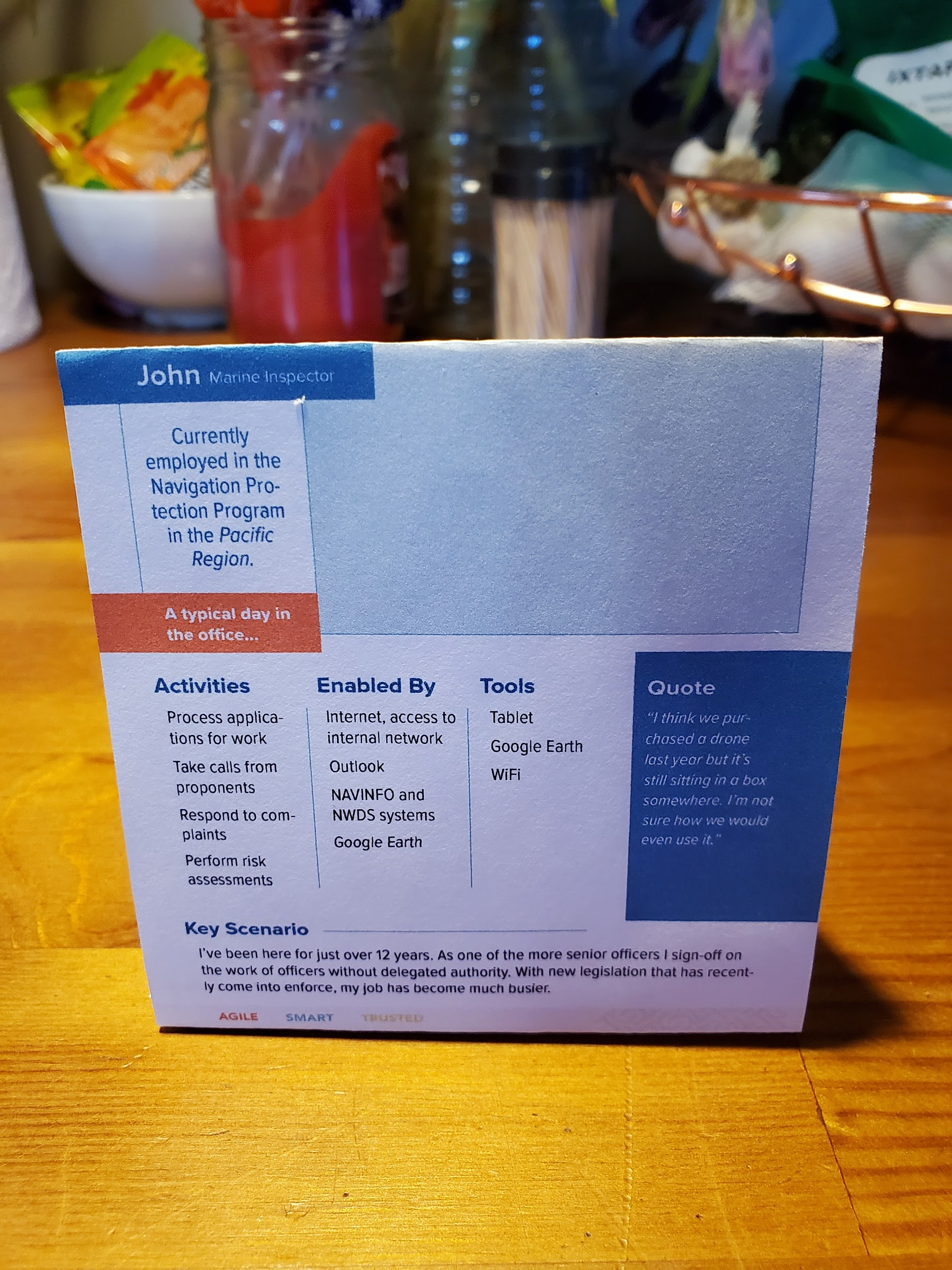 An example of a digital prototype: Here is how the Drone Companion App evolved through testing and iterating: 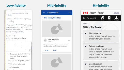 [Image caption: the same screen state is shown in different levels of fidelity from low, to mid, to high. The low is a paper sketched version. The medium fidelity uses placeholder images and standard android components. The high fidelity state has branding and follows government standards. |
Public opinion research (POR)
| Definition | Public opinion research (POR) is the planned, one-way systematic collection of opinion-based information from the public, private individuals, and representatives of businesses or other entities by or for the Government of Canada. |
|---|---|
| Source | Defining Public Opinion Research, Treasury Board Secretariate |
| In our own words | Public opinion research comes from traditional market/business research methods. It seeks the opinion-layer of human experience--the “I think” layer. Design research goes deeper into the behaviours and emotions of users. However, to access the deeper layers, one could start at opinions and preferences. (This is why separating POR from design research makes a cohesive research approach more difficult.) CDS articulates the difference between POR and design research in the Design Research Handbook. |
| Demonstration | The Digital Drone Collective used previously collected POR research on drone use to inform their design research strategy. In a February 2019 POR survey of Canadian drone operators, 50% of respondents considered themselves ‘not knowledgeable’ in regards to current drone regulations. This helped the team advocate for a holistic research approach to uncover why compliance in this area is so low. They cite these sources in “References” on page 10 in the Transition Manual - Drone Companion App. |
Q
R
S
Service design
| Definition | Service design is the activity of planning and organizing a business’s resources (people, props, and processes) in order to (1) directly improve the employee’s experience, and (2) indirectly, the customer’s experience. Service design improves the experiences of both the user and employee by designing, aligning, and optimizing an organization’s operations to better support customer journeys. |
|---|---|
| Source | 1. Service Design 101, Nielsen Norman Group |
| In our own words |
Service design is the activity of:
Service design becomes particularly important when growing business channels in the digital space. Often the digital product can take the spotlight (especially in planning and resourcing). This leaves out the answer of how the different channels of service delivery will operate going forward. |
| Demonstration |
The Drone Portal was the first fully digital service produced by Transport Canada. It was released to the public the same day as the new regulations, in January of 2019. Even though the Drone Portal was delivering several services, the project was managed as an IT project. Once live, the team found themselves dealing with an unmanageable amount of technical support emails. Before going digital, all support was handled through a phone line. Or one-on-one over email with the agent responsible for approving the flight operations. They had not taken into consideration how a digital service would need a different type of support to ensure the smooth delivery. Taking a service approach could have avoided a lot of frustration from both end-users and those in the Task Force. - Stakeholder Interview Findings - CoE Mandate research, (2019) |
Service blueprint
| Definition | A diagram that visualizes the relationships between different service components - people, props (physical or digital), and processes - that are directly tied to touchpoints in a specific customer journey. |
|---|---|
| Source | Nielsen Norman Group |
| In our own words |
This artifact represents a service-view of a business and it’s architecture. It can hold all variables of a service’s design, including, but not limited to:
|
| Demonstration | Here’s an example of a Service Blueprint for issuing flight crew permits (PPC) at Transport Canada. PPC Service Blueprint When a service-view is applied at a program level, you can start to design government services to the life journeys of people. The Government of New Zealand has championed “life journey services”. An example of a service designed around becoming a parent. StartSmart.services.gov.nz |
T
U
Usability
| Definition |
|
|---|---|
| Source | |
| In our own words |
Usability = Utility + Usefulness Utility = mechanism for performing a task Usefulness = how well the mechanism performs the task Usability is defined by 5 quality components:
|
| Demonstration | Usability study findings presentation from the Digital Drone Collective. |
User research
| Definition | User research focuses on understanding user behaviors, needs, and motivations through observation techniques, task analysis, and other feedback methodologies.1 This field of research aims at improving the usability of products, services, or processes 2 by incorporating experimental and observational research methods to guide the design, development, and refinement of a product.3 User researchers often work alongside designers, engineers, and programmers in all stages of product creation and idealization.4 |
|---|---|
| Source |
|
| In our own words |
User research is a reality check. It tells you what happens when people use the thing. It helps us move away from relying on logic alone, and to design for the world as it is. For more: Acting on User Research The field of user experience has a wide range of research methods available. These range from tried-and-true methods, to those that have been more recently developed. For more: When to Use Which User-Experience Research Methods Additionally, there are a few myths worth debunking here: Myth 1: it takes a lot of people, resources, time, and money. It could indeed, but it depends. Some research methods can be cost-effective. And a little research is better than no research. Myth 2: it can only happen at specific times. It can happen as many times as the circumstance allows. Myth 3: it’s a UX design thing. Many people other than designers conduct user research in one way or another. |
| Demonstration | 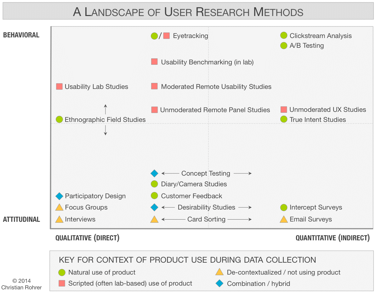 [Image caption: A landscape of User Research methods. The y-axis spans from attitudinal to behavioural. The x-axis spans from qualitative to quantitative. Different methods are placed accordingly. For example, “interviews” are in the bottom-left quadrant, indicating it is attitudinal and qualitative.] [Image caption: A landscape of User Research methods. The y-axis spans from attitudinal to behavioural. The x-axis spans from qualitative to quantitative. Different methods are placed accordingly. For example, “interviews” are in the bottom-left quadrant, indicating it is attitudinal and qualitative.]Usability study findings presentation from the Digital Drone Collective. |
User Experience Design (UX, UXD, XD) (see related: human-centred design, design, co-design)
| Definition | "User experience" encompasses all aspects of the end-user's interaction with the company, its services, and its products. |
|---|---|
| Source | The Definition of User Experience (UX), Nielsen Norman Group |
| In our own words | User Experience Design and Human-Centred Design are essentially the same thing. It’s creating solutions and making decisions based on the experience of the intended recipient/user. A difference could be that user experience design (UXD) applies human-centred design (HCD) to the digital world. In this, HCD refers to the field of design, and UX as where it's applied. As in, UX designers would say they base their craft on human-centred design. Most UX designers are employed by technology companies and work on digital products, like websites and mobile apps. |
| Demonstration | Here’s a blog of some good UX design choices determined heuristically using Neilsen Norman Group’s 12 Heuristics. |
User Interface Design (UI)
| Definition | User interface design (UI) is the design of user interfaces for machines and software, such as computers, home appliances, mobile devices, and other electronic devices, with the focus on maximizing usability and the user experience. The goal of user interface design is to make the user's interaction as simple and efficient as possible, in terms of accomplishing user goals. |
|---|---|
| Source | 1. Norman, D. A. (2002). T"Emotion & Design: Attractive things work better". Interactions Magazine, ix (4). pp. 36–42. Retrieved 20 April 2014. |
| In our own words | It’s easy to associate UI design with the design on the screens of mobile phones and laptops. But UI design goes well beyond digital devices and tangible screens. Door knobs and water tap handles are good examples of physical user interface. In the case of VUI (Voice User Interface), UI design means designing how your voice assistant responds to your speaking requests. The rule of thumb is this: in whatever you can interact with, there’s a user interface someone needs to design for you. |
| Demonstration | Here’s the UI board for the Drone Companion App. |
V
W
X
Y
Z
Terms of use

This work is licensed under a Creative Commons Attribution-NonCommercial-ShareAlike 4.0 International License.
- Date modified:
